I create Innovative multimedia designs for organizations and people who want to connect with a target audience in meaningful ways.
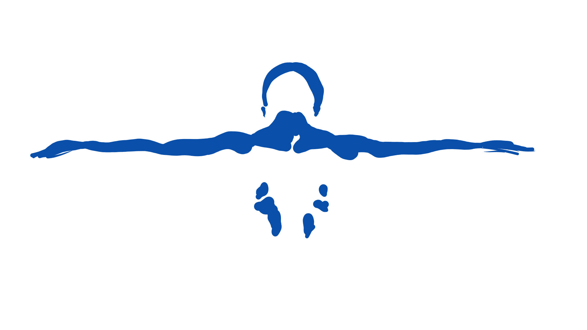
Above image: a logo design concept for a massage therapist who specializes in sports medicine and pain management. the client wanted the logo to represent his approach: the benefit of massage therapy for optimizing performance, recovery and overall health maintenance. after discussion with the client, I settled on the image of a human back with outstretched arms, showcasing the shoulder muscles to create an image of strength. the client also wanted the image to communicate a sense of focus, with a clean and flowing aesthetic. the color blue was chosen to communicate the idea of health, wellness, and calm.
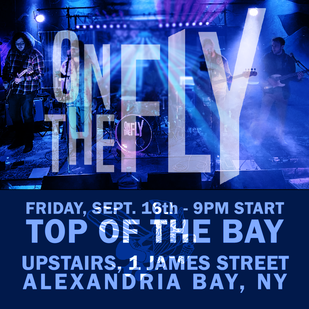
Above: A Digital Poster Promoting a local show by the band on the fly
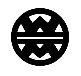
above image: a logo design for windward music, a music shop and guitar maker from canton, Ny. the client wanted to create a logo with a clean and geometric aesthetic. it had to be eye catching, but simple. The client stated that the design had to be easily replicated within his wood inlay work. he also wanted the design to have strong elements of symmetry. after several concepts we settled on this as the final logo.
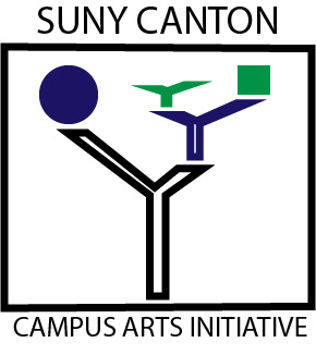
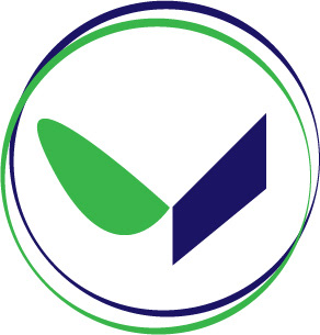
Above: (1) I created a design for suny canton's campus arts initiative, a new entity for the college which was created to serve the purpose of promoting the arts on campus. The logo had to be clean and reflect on elements of the suny canton college logo. the college logo is known for the colors green and blue. the logo contains a green leaf and a blue parallelogram which are meant to represent the balance of sustainability and technology. for the campus arts initiative logo, I used this concept of balance in a recognizable but abstract way, also suggesting the presence of abstract sculptures which can be found on the campus.
(2) Just below the logo for the campus arts initiative is a secondary logo representing the 'art that heals' campaign which was a major focus of the campus arts initiative during 2020. I designed this logo to reflect closely upon the suny canton logo, yet having a slightly softer aesthetic with more organic curves. the goal was to communicate a sense of openness, community, and empathy while still retaining the strong abstract qualities of the original college logo.
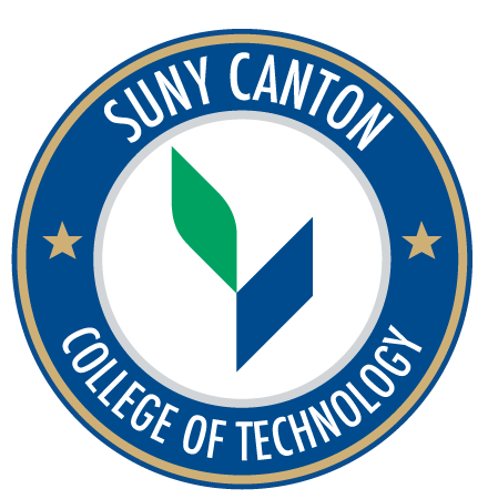
(3) the original suny canton college logo, included for comparison. (i did not design this logo)
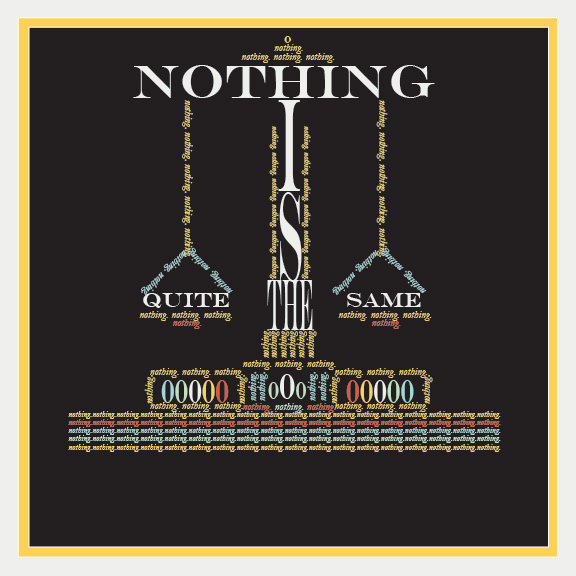
above: typographic illustration as a concept for a magazine article. I took the phrase "Nothing is quite the same" and transformed it into an illustration which communicates several interpretations of the phrase.
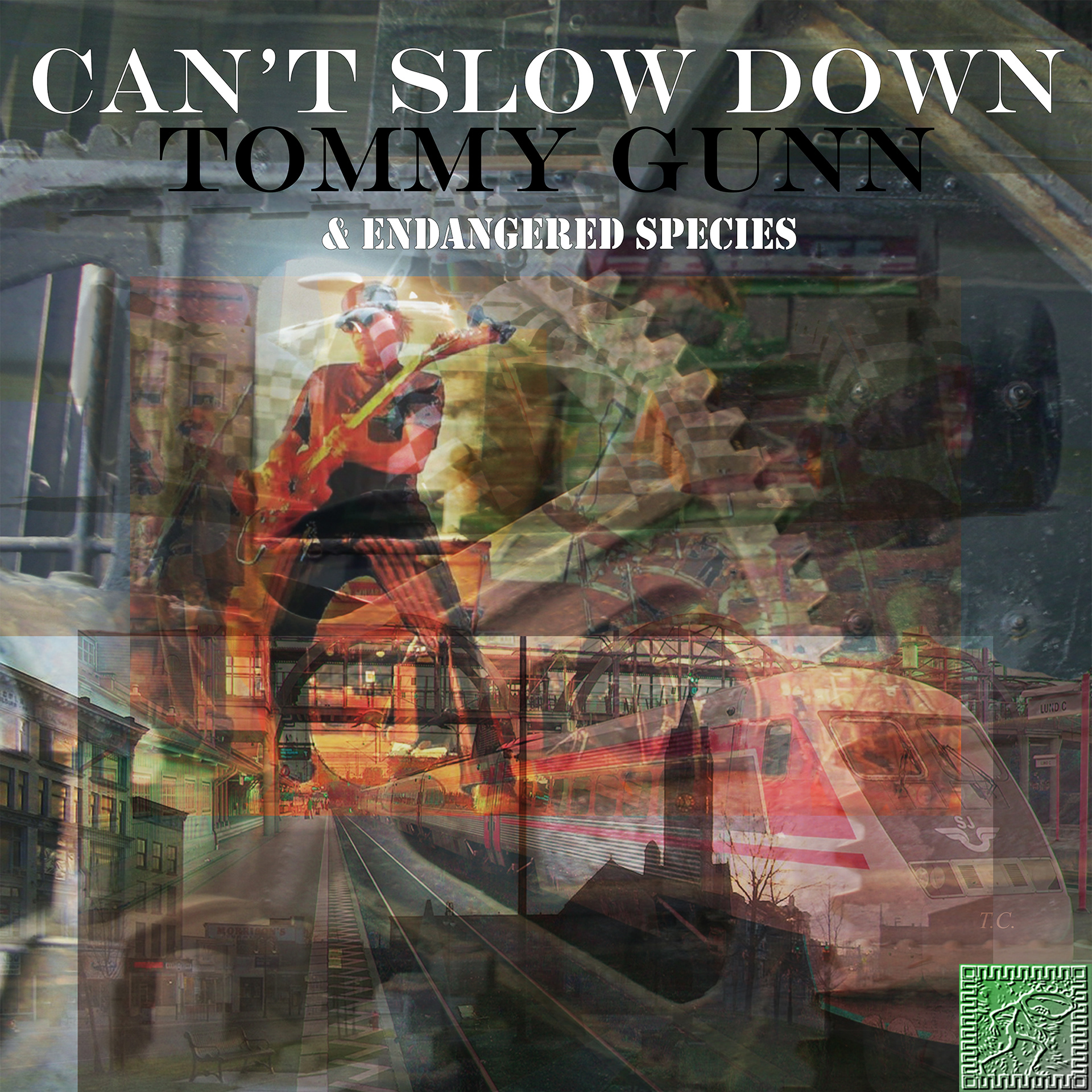
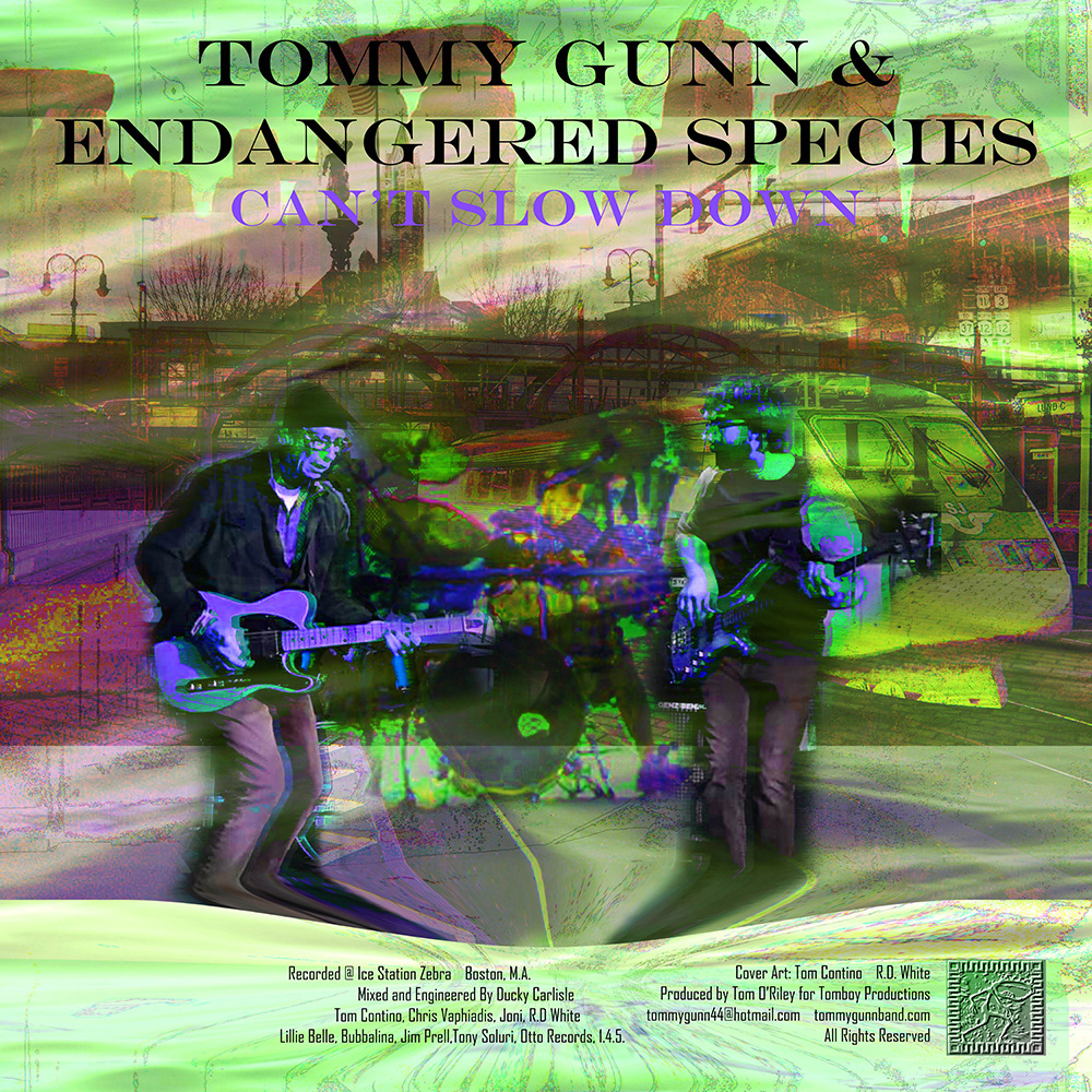
Above: front and back design album art for local musician tommy gunn and endangered species' summer single, 'can't slow down'. the client provided me with photographs by photographer R.D. White, and we discussed ideas for a digital collage to represent the ideas of the song. One of the focus points was the idea of time, and how in the words of Tommy Gunn, "you never have as much of it as you think". I also included images of watertown, NY, especially the downtown square's church clocktower. trains, racecars, and industrial gears help communicate the sense of 'racing the clock' and the fear of growing old.
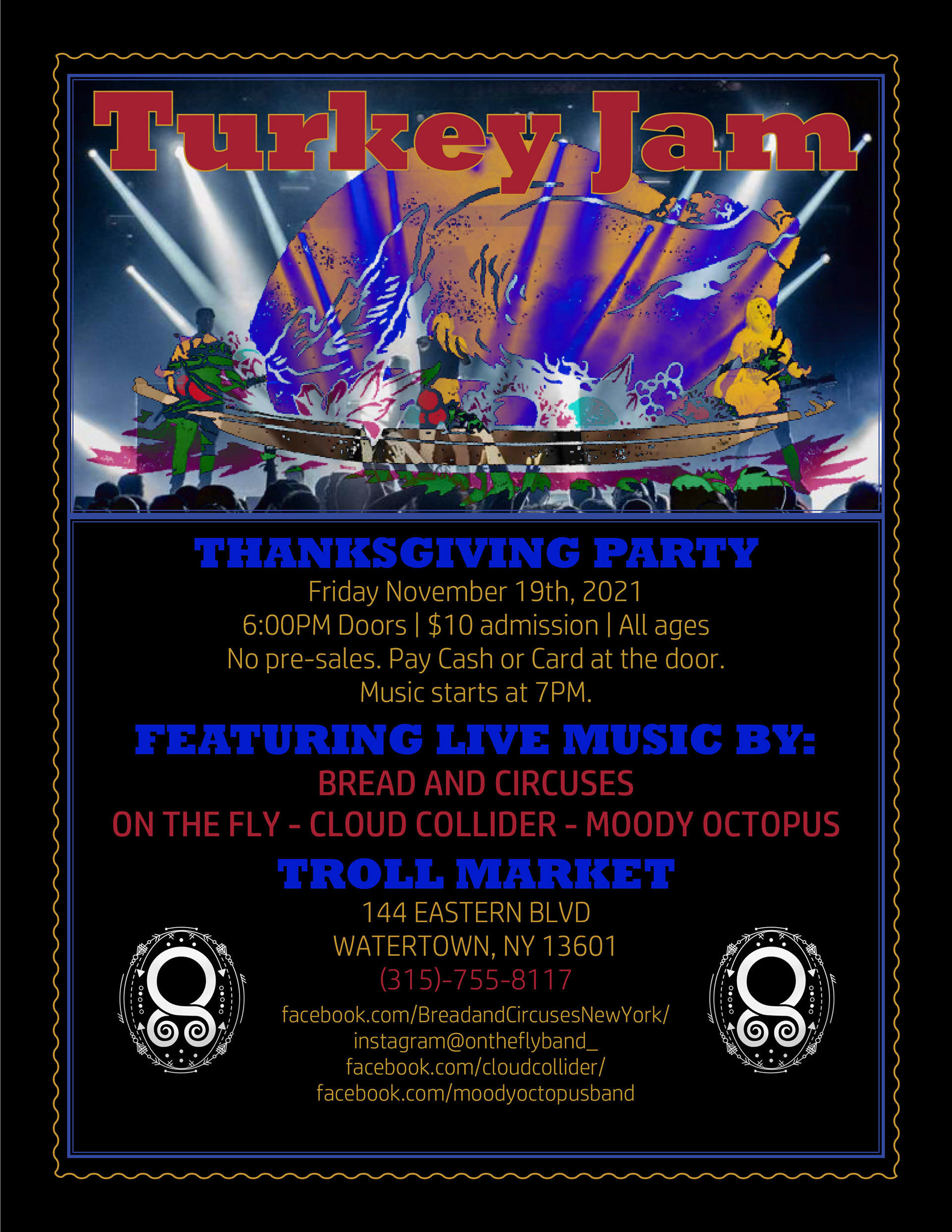
Above: Poster Design for the Troll Market's Turkey Jam event, which included performances by multiple local bands. The client wanted a poster which was simple, elegant, and exciting. I used a photograph of a rock band on stage, superimposed with an illustration of a thanksgiving turkey. The client stated not to "use too many traditional thanksgiving colors", instead wanting the poster to appear more modern and exciting. the goal was to appeal to a younger audience who might be looking for something to do while visiting the area for thanksgiving. I created this poster as the first draft and the client was happy with it immediately, saying it was exactly what they had in mind and requested no further changes. the poster was shared on social media and printed for physical displays.